Working with Results
Introduction
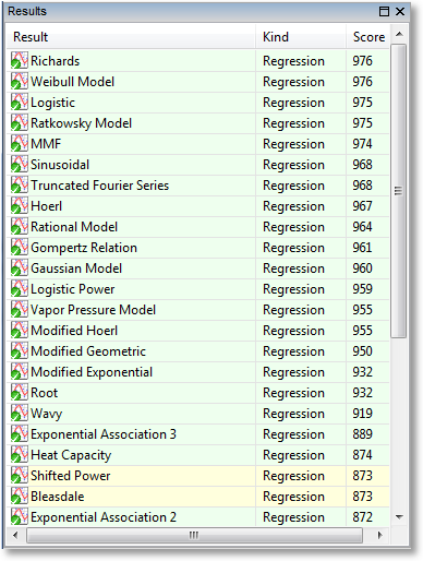
Once any results have been calculated, whether they are curve fits (regressions), interpolations, smoothings, or functions, they appear in the result pane ranked in order of their score (the result pane normally is shown in the upper left part of the CurveExpert Professional application, see User Interface). The score reflects how closely the model adheres to the underlying data. Note that functions (as opposed to models) do not have a score, as they are not associated with the data directly in any way.
In the results pane, the results can also be sorted by any of the items displayed in the column header (name, kind, family, score, correlation coefficient, coefficient of determination, or standard error) simply by clicking the appropriate column header. Note that you can right-click on the column header in order to customize what is displayed in the results list; by default, the name, kind, and score is displayed.
When selecting results, you can simply click on the result (which selects it), or use multiple selection by holding down SHIFT or CTRL when clicking on results. This allows you to apply an operation to batches of results at once.
Every result in the results pane has a unique icon indicating the kind of result that it is. The table below shows meaning of each icon.
Icon |
Meaning |
|---|---|
|
Linear regression model (includes polynomials) |
|
Nonlinear regression model (curve fit) |
|
Data smoothing |
|
Function |


Color Coding
Also in the results pane, each result has a color coding of green or yellow. An example is shown below:
A green color coding indicates that the result was calculated successfully; it does not mean that the result is necessarily good; that is indicated by its score. The green coloring only indicates that the calculation of the result proceeded smoothly, and it is not possible to get a better result than what is given. In the common parlance of nonlinear regression, the parameters of the fit are said to be “converged”.
A yellow color coding indicates that the result should only be used with caution. It indicates that the calculation succeeded, but with reservations. The most common cause for this is a nonlinear regression calculation that did not converge before the maximum number of iterations (configurable via Edit->Preferences->Regression) was reached. Again, the score will indicate how well the model adheres to the data.
If a result is presented in yellow, it is highly recommended to examine the residual and parameter histories to see if the parameters would have changed further if the max number of iterations is higher. Double click on the result in the results pane, and select the Convergence tab in the resulting dialog. Also examine the PHist tab.
Badges
Every result is badged with either a green checkmark or a yellow exclamation point. The intention here is to inform the user when a result becomes invalid due to a change in the underlying dataset. For example, if a nonlinear regression is calculated, and then the dataset is scaled (using, say, the tools in the Data menu), that nonlinear regression becomes invalid, and an attention badge is placed on that result in the results pane to signify this.
To remedy the situation, you can update the result yourself by right clicking on the result and selecting “Update”, or, if you would like to keep the old result and compute a new one, simply reselect the desired result from the Calculate menu, and an entirely new result will be generated.
Badge |
Meaning |
|---|---|
|
Data unchanged since calculation of this result |
|
Data changed since calculation of this result |


Previewing
Pointing at a result will show its preview in the preview pane, usually at the bottom left of your application. Also, the standard error and correlation coefficient, if applicable, will display in the status bar at the bottom of the application window.
Placing Results on a Graph
There are several ways for a result to be shown on a graph; the first is automatic, in that the top scoring results (usually the top 3), are automatically placed in the “Top Results” graph whenever a new calculation is performed.
To place a specific result on a graph that you have created (press “+” in the Graphs and Data pane), you can:
right click a result in the Results pane, and select Send to New Plot. This will create a new graph with the default graph theme (as selected
in the application preferences), and add the selected results to that plot. * right click a result in the Results pane, and select Send to Current Plot. This will plot the selected results directly on the active plot. * drag and drop the result from the Results pane into a graph, and that will add the result to the graph.
Note
To send multiple results to a graph at once, you can multiple select items in the result pane with either the shift or control key. Then drag and drop, or right-click and select Send to New Plot or Send to Current Plot as normal.
Removing Results
If you decide that a result is no longer needed, select it, right click, and pick Remove. This action is not undoable, but certainly the result can be calculated again by simply picking it from the Calculate menu.
Like placing results on a graph, you can remove multiple results at once by shift-clicking or control-clicking to select the results that you want to remove. If the results are shown in any graph, they are removed from the graph as well.
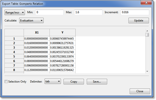
Creating/Exporting a Table
Directly from a result, you can generate a table that consists of a column of x (independent variable) data, and the corresponding column of the result evaluated at each of the points.
Here, the user can specify the x (independent variable) data, and CurveExpert Professional will fill in the y (dependent variable) data. There are four methods to specify the x data: 1) by min, max, and increment for evenly spaced data, 2) by min, max and number of points for evenly spaced data, 3) use the x data from the currently loaded dataset, or 4) by reading a file. Set the first pulldown to “Range/incr”, “Range/npts”, “Data”, or “File” as appropriate to select the method by which you would like to specify the data.
For specifying by Range (with the spacing specified), select Range/incr and set the min, max, and increment of your table, click Update, and the table spreadsheet will update to show the calculated values. To write the table, press Save… at the bottom. Alternatively, if you want your table on the clipboard for subsequent pasting into another application, press Copy.
For specifying by Range (with the number of points specified), select Range/npts and set the min, max, and number of points (rows) of your table, click Update, and the table spreadsheet will update to show the calculated values. To write the table, press Save… at the bottom. Alternatively, if you want your table on the clipboard for subsequent pasting into another application, press Copy.
For specifying by Data, there is no further work to do aside from setting the first pulldown to “Data”. The independent variable (x) will be extracted from the current dataset and utilized.
Likewise, for specifying by File, set the first pulldown to File, and click the Browse button to locate the file that you would like to read. Ideally, the file should be made up of a single row or a single column of data that will become the x data. If the file is made up of multiple columns, CurveExpert Professional assumes that the first column should be used as the x data. This capability allows the user to read datasets related to the original easily. As soon as a new filename is entered into the control, it will be read. To write the table, press Save… at the bottom. Alternatively, if you want your table on the clipboard for subsequent pasting into another application, press Copy.
Normally, an “Evaluation” style table is appropriate; an evaluation table simply evaluates the results at each of the points in the independent variable column. An “Accumulation” table computes the integral

for every point in the dataset, where  is the min value specified for the table.
At the bottom of the table, before you copy or save, you can pick Selection only to only save the data that you have currently selected in the table spreadsheet. Otherwise, the entire table is saved or copied. Also, you can select the delimiter to use between values on the same row. The default delimiter can be set at Edit->Preferences->General->Default delimiter.
Copying Result Information
Right clicking on a result will allow you to select Copy All Info, which will copy a report about the selected result(s) to the clipboard.
If the selected result is a regression, the entry Copy Parameters will also appear. Select this to copy only the parameter name/value pairs to the clipboard, separated by the delimiter selected in the application preferences.
Querying Result Details
If you want to get more detail on a calculated result, either double-click it in the Results pane, or right-click and select Details. This will display a window very similar to the following:
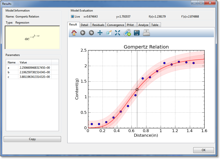
In the result details window, you can examine a particular result much more closely. The left pane shows the name of the result, its family, and an equation for the result, if applicable. For a model, the fitted parameters are also shown on the left. To copy result details to the clipboard in text format, simply click the Copy button.
The notebook on the right contains several items of interest, most notable of which is the result graph (in which a graph is shown with just the data and the single result), and the table tool, in which a data table can be generated with this result. The following sections describe each section of the notebook.
Result Graph
The result graph simply shows the data and the current result, so that you can visualize the result without the (possible) clutter of having other results on the same plot. All of the graphing capabilities (see Graphing) are also available here, including zooming, panning, changing the graph properties, saving the plot to file or clipboard, and printing.
As you move your pointer over the graph, the live model evaluation tool above the notebook activates and displays your current xy location, the result evaluated at x, and the result’s derivative evaluated at x. A marker follows the result depedending on where the mouse pointer is placed. This behavior can be disabled by unchecking the “Live” box above the graph, or it can be made to only activate when the left mouse button is pressed ( by setting the “Live” box to its intermediate state).
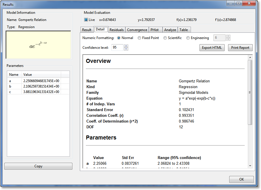
Detail
The Detail notebook section contains a formatted report that shows the basic statistics of the result, such as the standard error, correlation coefficient, and coefficient of determination. Also, the covariance matrix and parameter uncertainties are displayed as appropriate.
The style of numeric formatting can be adjusted using controls at the top of the report, where you can choose from normal, fixed point, or scientific notation (and choose the precision for each as appropriate). Also, you can choose the confidence level with which the parameter uncertainties are reported. Any adjustment to any of these controls will cause the report to be regenerated automatically.
Press the Export HTML button in order to export an HTML file of the report. Press Print Report in order to send the report directly to the printer.
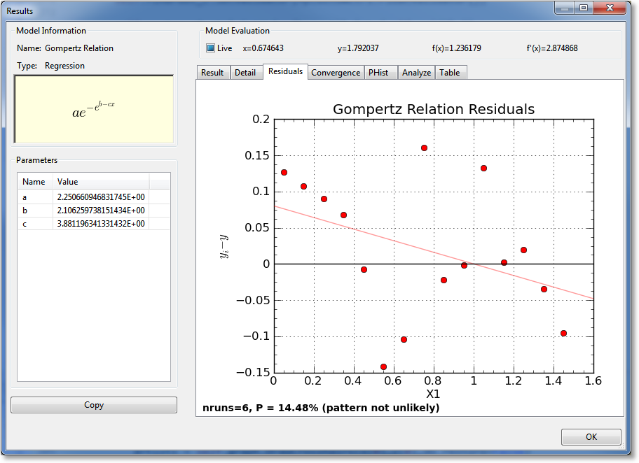
Residuals
The Residuals notebook section shows the difference between the result and the data, as a function of the independent variable. All of the graphing capabilities (see Graphing) are also available here, including zooming,panning, changing the graph properties, saving the plot to file or clipboard, and printing.
Also displayed on the residuals plot is a straight-line fit to the residual points. This regression line (colored light red) shows whether there is an upward or downward trend to the data (indicated by the slope of the line) as well as showing whether the residuals bias upward or downward.
Also, a Wald-Wolfowitz runs test is performed on the residuals. At the bottom of the plot, the observed number of runs is listed, as well as the likelihood that this observed number of runs could occur if the model used to fit the data was correct (i.e., the residuals are randomly distributed around the curve). If the probability is less than 5%, CurveExpert Professional states that the run pattern of the residuals is unlikely; if greater than 5%, the pattern is not unlikely (which is distinctly different than being likely, which cannot be claimed). A higher likelihood is desirable, obviously.
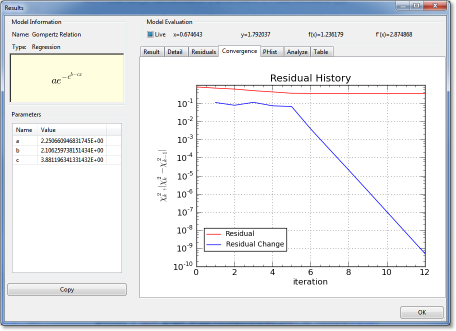
Convergence
For nonlinear regressions (which is the only type of result for which this page appears), a graph of the convergence history is displayed. The norm of the residual (difference between the result and the data) is shown as a function of iteration number, and the change in the residual is also shown as a function of the iteration number. If the iteration has converged, the residual on the last iteration should be to the level set in the application preferences. One exception to this is if the iteration has terminated based on lack of change in parameters, rather than lack of change in the residual.
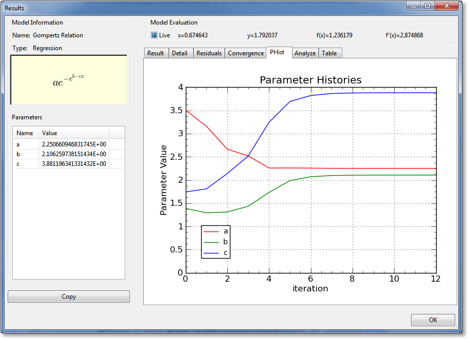
Parameter Histories (PHist)
For nonlinear regressions (which is the only type of result for which this page appears), a graph of the parameter histories is displayed. The value of each parameter is shown as a function of iteration number. Here, you can see whether or not the parameters have “settled” on a particular value before the iteration was terminated. Unless the iteration is terminated due to exceeding the maximum number of iterations set in the application preferences, the parameters are always flat at the right side of the plot, indicating that they are settled.
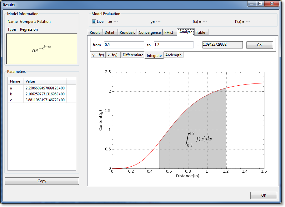
Analyze
The Analyze notebook page is a toolbox of mathematical operations that you can apply to the current result. Select the operation that you want to enact by selecting the appropriate sub-tab. You can calculate y as a function of x, x as a function of y, differentiate the result, integrate the result, or compute the arclength of the result. Simply select the appropriate sub-tab, fill in the numbers, and hit Go. Also note that pressing Enter in any of the fillable fields is the same as hitting the Go button; this allows you to quickly change the numbers being computed without having to reach for the mouse.
For each type of result, a helpful graphic will be drawn on the graph. For example, if integrating, the area under the curve between the two limits of integration will be shown.
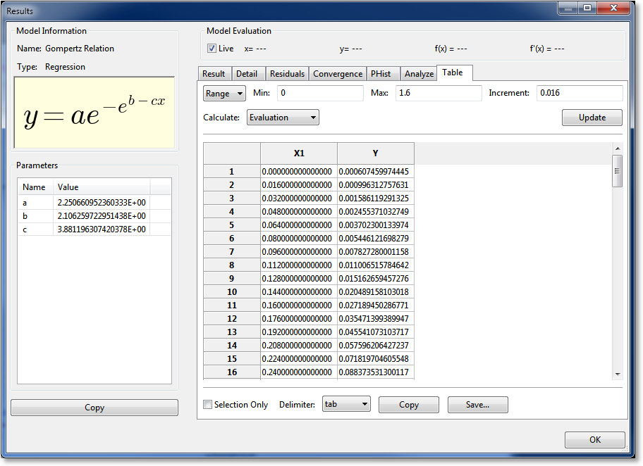
Table
The Table notebook page allows you to create data tables corresponding to your result. Here, the user can specify the x (independent variable) data, and CurveExpert Professional will fill in the y (dependent variable) data. There are four methods to specify the x data: 1) by min, max, and increment for evenly spaced data, 2) by min, max and number of points for evenly spaced data, 3) use the x data from the currently loaded dataset, or 4) by reading a file. Set the first pulldown to “Range/incr”, “Range/npts”, “Data”, or “File” as appropriate to select the method by which you would like to specify the data.
For specifying by Range (with the spacing specified), select Range/incr and set the min, max, and increment of your table, click Update, and the table spreadsheet will update to show the calculated values. To write the table, press Save… at the bottom. Alternatively, if you want your table on the clipboard for subsequent pasting into another application, press Copy.
For specifying by Range (with the number of points specified), select Range/npts and set the min, max, and number of points (rows) of your table, click Update, and the table spreadsheet will update to show the calculated values. To write the table, press Save… at the bottom. Alternatively, if you want your table on the clipboard for subsequent pasting into another application, press Copy.
For specifying by Data, there is no further work to do aside from setting the first pulldown to “Data”. The independent variable (x) will be extracted from the current dataset and utilized.
Likewise, for specifying by File, set the first pulldown to File, and click the Browse button to locate the file that you would like to read. Ideally, the file should be made up of a single row or a single column of data that will become the x data. If the file is made up of multiple columns, CurveExpert Professional assumes that the first column should be used as the x data. This capability allows the user to read datasets related to the original easily. As soon as a new filename is entered into the control, it will be read. To write the table, press Save… at the bottom. Alternatively, if you want your table on the clipboard for subsequent pasting into another application, press Copy.
Normally, an “Evaluation” style table is appropriate; an evaluation table simply evaluates the results at each of the points in the independent variable column. An “Accumulation” table computes the integral
for every point in the dataset, where is the min value specified for the table.
At the bottom of the table, before you copy or save, you can pick Selection only to only save the data that you have currently selected in the table spreadsheet. Otherwise, the entire table is saved or copied. Also, you can select the delimiter to use between values on the same row. The default delimiter can be set at Edit->Preferences->General->Default delimiter.
Comparing Two Regressions
CurveExpert Professional has the capability of comparing two regressions (curve fits) to provide some basis for the superiority of one versus the other. To compare two regressions, simple right click on a regression in the Results Pane, and pick Compare To.
The compare tool will appear, which presents a report in the left side, and the graph, with both regressions drawn, in the right side. By default, both regressions will have their confidence and prediction bands shaded in matching colors with their curve. If desired, these can be turned off by modifying each curve’s properties via the normal properties dialog (right click and select Properties, or as a shortcut, press 2 or 3).
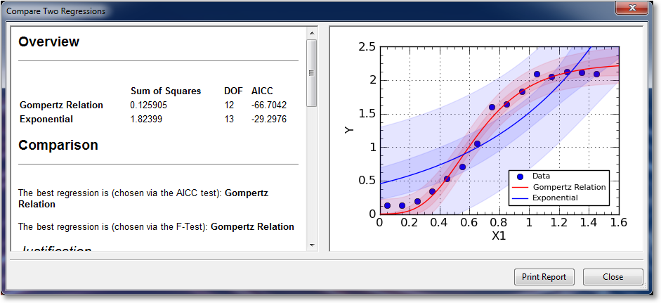
To compare two regressions, CurveExpert Professional uses both the Akaike Information Criterion (AIC) test, and the more commonly known F-Test. The better of the two fits, as judged by these two tests, is shown at the top of the report in the Comparision section. Following the best fit choices, a justification is given as to the reason for the choice, as well as supporting calculations.
One should note that the F-Test is only valid in cases where one model is a subset of the other; i.e., the less complex model can be obtained from the more complex one by judicious choice of the model parameters. CurveExpert Professional, at this time, has no means of determining whether or not this is true, so the interpretation of the F-test results is left up to the user. the AIC test is valid in any case, and is therefore the preferred method of comparision in CurveExpert Professional.
If you would like to print the report, simply click Print Report at the bottom of the comparison tool. Also, any part of the report can be copied out with the normal copying procedure (highlight and then pres Ctrl+C).
Confidence and Prediction Bands
For any regression (linear or nonlinear), the confidence bands and prediction bands can be shown. In order to show these bands, and/or change their appearance, right click the plot, select Properties->Series, and then select the appropriate series (alternatively and much more quickly, if the regression is the 3rd entry in the legend, press 3). If the series is a regression, options to control the appearance of the confidence band and prediction band will be present. See Series Page for more information on changing the appearance of the bands.
The confidence band is the area that has a certain likelihood (typically 95%, but you can adjust the level to your liking) of containing the true curve that fits the data.
The prediction band is the area that has a certain likelihood (typically 95%, but you can adjust the level to your liking) of containing any future data points. The prediction band is always wider than the confidence band.