Graphing
Introduction
Graphs are also themeable in order to save the user time in the production of a large number of similar plots.
In GraphExpert Professional, an arbitrary number of graphs can be created and saved. The rendering of the plots is of publication quality, with full antialiasing support and the ability to extensively customize each graph. Graphs can be saved to a variety of graphics file formats, and they may be directly copied and pasted into another application. XY plots, polar plots, scatterplots, 3D surfaces, and contour plots are supported. Graph themes allow you to customize a look that you prefer, and reuse it. Graphs are interactive, with zooming, panning, autoscaling, and the ability to move backward to previous views of the graph.
Graph Types
There are three types of graphs supported by GraphExpert Professional. These three types are XY, Polar, and 3D.
XY Plots
XY plots, by definition, have two axes in Cartesian space. XY plots are appropriate for showing relationships between cause and effect, or equivalently, the relationship between one independent variable and one dependent variable.
Note that XY plots can also display contours (both filled and unfilled), and is the appropriate plot type to use for contour plots. Contour plots show the relationship between two independent variables and one dependent variable.
Polar Plots
Polar plots have one radial axis and one angular axis. Polar plots always treat the angular axis in radians, although
the numbers shown on the angular axis can easily be formatted as degrees. In other words, a dataset that ranges between
![[0,2 \pi]](_images/math/a4e858da57ffbdd0edc0b4ff157aab42fee88ed3.svg) will completely wrap around a polar plot.
will completely wrap around a polar plot.
3D Plots
3D plots have three axes; two for independent variables X1 and X2, and the third in the vertical direction for the dependent variable (Y).
Basics
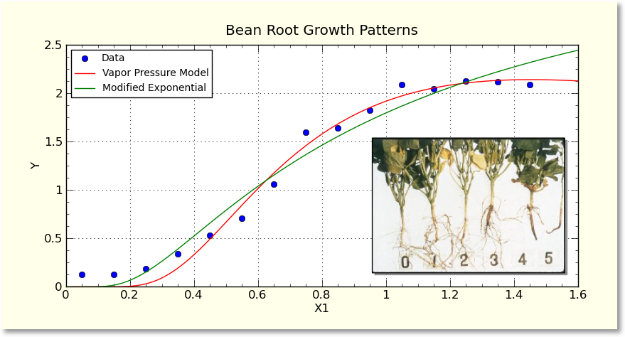
The graphing area is divided into two primary portions; the toolbar, which is situated along the top of a graphing area, and the graph canvas, where the plot is drawn. The toolbar allows interactivity with the graph, such as panning, zooming, and autoscaling. Right clicking on the plot canvas shows the graphing menu, where you can customize items on the plot like the axis labels, title, and the look of the graph. Also from this menu, you can print, copy to clipboard, or save your graph in one of many picture formats. An example of a graph is shown below:
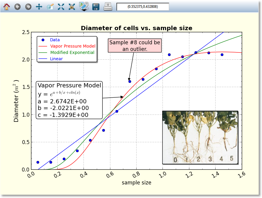
Right clicking on elements in the graphs (such as legends, images, annotations, and colorbars) show appropriate menus for manipulations of
those objects.
Also, remember that anywhere that you can change the text on a graph (such as the title or axis labels), you can use
Mathtext for high quality rendering of mathematical expressions and symbols. For example, in the above graph, mathtext
was used to render the m^2 part of the y axis label. See Mathtext for details.
The hotkeys (keyboard shortcuts) for use with graphs are documented in Keyboard Shortcuts for Graphs.
Interacting with a graph
Interacting with a graph is quite straightforward; the mouse cursor always gives a hint of what can be done to various elements on a graph; a cursor that consists of four arrows indicates that the pointed-to-element is moveable, activateable, and possibly resizeable. A hand cursor means that the pointed-to-element can be activated. In this context, “activating” means to show a dialog box to modify the properties of the element in question.
Further, the frame of the graph can be moved and resized by pressing shift (or ctrl) and clicking anywhere inside of the frame. Equivalently, the ‘r’ key can be pressed while the mouse pointer is inside of the frame. This displays a standard set of resizing handles that you can use to move the edges of the graph frame into the desired locations.
Graph Toolbar
The first style of interaction with a graph is to use the toolbar. A sample of a toolbar is shown below:

All buttons have tooltip help, so if you can’t remember what a button does, either watch the status bar at the bottom of the main window as you point to the buttons, or hover your mouse over a button to see its function.
Home, Back, Forward
As the graph view changes interactively, each view is saved so that you can return to a previous one at any given time. If you change the view via the zoom/pan/autoscale controls, you can return to a previous view by clicking the Back button, and once you have done this, you can move forward to the next view by clicking the Forward button. Pressing the Home button will return you to the initial view of your graph.
Pan

The pan button allows you to move the graph extents with your mouse. Press the pan button to begin a pan operation, press and drag in the plot to move it around, and then press the pan button again to end the pan operation. Using the right mouse button to drag during the pan manipulates each axis independently in a pseudo-zooming operation.
Polar Panning
For polar plots, the pan button allows zooming in on the radial axis. With the right button, the location of the radial axis labels can be moved by right clicking and dragging them into place.
3D Panning
For 3D plots, the pan button allows more transformations than just a simple move, depending on the mouse button that is depressed.
The left mouse button moves the entire XYZ axes box around on the background canvas, and is analgous to panning a virtual camera pointed where the view direction is unchanging.
The right mouse button stretches axes in the direction in which you are dragging the mouse, and is also affected by the location at which the drag starts (called the grab point). For example, if you right click and hold at the center of the axes box (grab point at the center), and drag right, the X1 and X2 axes expand in size. If you grab in the center of the axes box and drag upward, the Y axes expands. Drag the opposite direction for a contraction. The grab point, in fact, is a fixed point. Grabbing at the right of a plot, for example, and dragging right, will contract the lateral directon of the axes, but will keep the right side reasonably fixed in the canvas.
A useful way of dragging is to grab in the center, and drag diagonally. This expands/contracts all three axes at the same rate, and has the effect of interactively moving the camera toward or away from the axes box.
In summary, the right mouse button manipulates the viewing frustum in regard to the axes box.
Zoom

The zoom button allows you to zoom in or out on a graph with your mouse. Press the zoom button to begin a zoom operation, and draw a box from top left to bottom right in order to zoom in, by clicking and dragging your left mouse button. To zoom out, drag a box with the right mouse button instead of the left. Note that the zoom box is not available for polar plots.
Autoscale

The autoscale button chooses new limits and new tick intervals for your graph that fit the current dataset. See also Autoscaling.
Autoscale lock

GraphExpert Professional will automatically autoscale your plot as data or results are added, changed, or removed. This is done according to Graphing Preferences. If you click the autoscale lock, it will prevent any of these automatic autoscales from affecting this particular plot. Note that as soon as GraphExpert Professional detects that you have manually set the axis limits or tick location properties (see Axis pages), the autoscale lock is set on your behalf. To release the lock, obviously, just click on the autoscale lock button again.
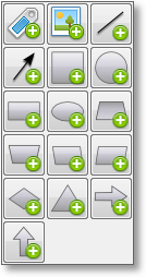
Add Artistic Element (Annotations, Images, Arrows)

The “add artistic element” button allows opens a tool palette in order for you to add a new drawing element to your graph. The three main classes of drawing elements that can be added are Images, Annotations, and Arrows. Note that “shapes” are just annotations without any text displayed inside of them; text may be added inside if you wish. Pressing this button shows the following tool palette:
The annotation button allows you to add an annotation (text box with an optional arrow) at any time. Pressing this button immediately adds an annotation, which you can then drag and drop to the desired location, as well as edit by right clicking the annotation and selecting Annotation Properties. For more information, see Annotations.
The image button allows you to add images at any time. Pressing this button allows you to browse for an image file (PNG, JPG, BMP, TIFF, GIF, etc.), which will be added, at its native resolution, to the graph. You can then interactively drag and resize the image much like a similar operation in regular photo/image packages. The image can also be edited by right clicking the image and selecting Image Properties. For more information, see Images.
There are two arrow-style buttons; one to add an arrow, and one to add a line. The only difference between the two is that an arrow has a single arrowhead at the destination by default, while the line (obviously) does not by default. The arrowheads, as well as other properties, may be changed by right clicking the arrow and selecting Arrow Properties. For more information, see Arrows.
The rest of the buttons in the panel allow you to add a shape to the graph, of the type depicted on the button. The list of available shapes (via the buttons) are: square, circle, rectangle, ellipse, trapezoid, inverted trapezoid, left parallelogram, right parallelogram, diamond, triangle, horizontal arrow patch, and vertical arrow patch. The properties of any of these shapes, including the type of shape, may be modified by right clicking the shape in the graph and selecting Annotation Properties. For more information, see Annotations.
Note
All shapes are considered Annotations, and can have text inside of them as well as an optional arrow.
Save

The save button allows you to save your graph in a variety of picture formats. Pressing this button shows a file chooser, so that you can select the file type and where to save the graph. See Saving graphs for more information, including supported image formats.

Locator
The locator always reports the location of your mouse, in data coordinates. Note that the locator is only activated for 2D plots only.
Dragging Elements on Graphs
Annotations, legends, images, graph titles, and colorbars are all draggable; meaning that they can be moved directly via interaction with the mouse. If any of these elements are not where you desire them be, simply click and drag it to the desired position.
Picking
If you point to a series on your graph, it will become highlighted. If you then double-click the mouse, a dialog will appear to allow you to change the properties of that series (color, marker style, etc.).
Further, if you right click on a series, you can also select Details in order to show the details for the underlying dataset or result associated with that particular curve. When right-clicking on a curve, there is also the opportunity to automatically add an annotation with information about that particular curve’s result; choose Autoannotate. This generates an annotation with the name of the result, equation, and coefficients (if applicable). The content of this annotation can then be edited just like any other annotation by right clicking it and selecting Annotation Properties.
Copy underlying data
If you right click on a curve, you can also access the data that the particular curve is built from. Pick Copy underlying data, and a table of numbers will be written to the clipboard. Now, you may paste these numbers into another application for further analysis and/or exploration.
In most cases, the table has the x data in the first column, and the y data in the second. However, if your dataset has an associated set of error bars, there will be a third and fourth column which list the values of the lower error bar, and the upper error bar, respectively.
If your curve has confidence or prediction bounds, the lo/hi values of the confidence or prediction bounds will be placed in additional columns (columns 3 and 4) as appropriate as well. In the case that both the confidence and prediction bounds are present, the lo/hi for the confidence bounds is listed in columns 3 and 4, and the lo/hi for the prediction bound is listed in columns 5 and 6.
Autoscaling
Every series on a graph has its own default minimum and maximum value along each axis. Autoscaling a graph means that each (visible) series will be tested, and the extents of each axis will be set to values that encompass all of the series.
If the series is a dataset, the minimum and maximum along each axis is determined from the dataset’s minimum and maximum along the corresponding axes (naturally). If the series is a continuous entity, such as a model or function, a specified “default domain” must be set in each direction for the autoscaler to use. This is set when the function is defined; see Functions for details. Note that this default domain is for autoscaling purposes only, and the graph extent along any axis can be set by the user to the desired values in the graph properties dialog, as described in Axis pages.
Exactly when the plot automatically autoscales is determined by the current preference settings in Graphing Preferences. If you click the autoscale lock, it will prevent any of these automatic autoscales from affecting this particular plot. Note that as soon as GraphExpert Professional detects that you have manually set the axis limits or tick location properties, the autoscale lock is set on your behalf. To release the lock, obviously, just click on the autoscale lock button again.
Adding images and annotations
Adding images and/or annotations can be done straightforwardly by clicking the appropriate “Add” button in the graph toolbar palette (see Graph Toolbar). However, there are other ways of adding annotations and images.
If text is on the clipboard, you can press Ctrl+V (Cmd+V on a Mac) on a graph, or right-click and select Paste. The text on the clipboard automatically becomes an annotation. You can also drag and drop text from another source for the same effect.
If an image is on the clipboard, you can press Ctrl+V (Cmd+V on a Mac) on a graph, or right-click and select Paste. The image on the clipboard will then be pasted to the graph canvas in its native resolution. You can also drag and drop an image file to the graph canvas for the same effect.
Changing Graph Properties
The graph properties window is divided by functionality into pages.
Axis pages
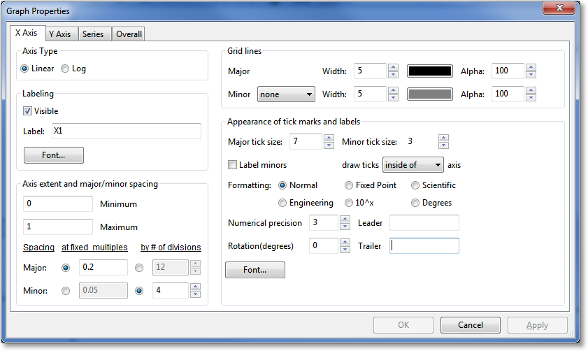
The axis pages (there can be two or three depending on whether you are working with a 2D or 3D graph) allow you to set properties such as the axis limits, labeling, and grid lines.
The Axis Type section allows you to set your axes to a normal (linear) scale, or a logarithmic scale. Note that logarithmic scales are not available on 3D graphs.
The Labeling section can be used to either hide the axis label, or specify the label itself. Also, the font and font color of the axis label can be selected by pressing the Font button in this section.
The Axis extent and major/minor spacing section allows you to specify the minimum and maximum value of the axis (determining its limits). To have your axis run in reverse, set the maximum of the axis less than the minimum.
The major and minor spacing can each be set in one of two ways: by a fixed amount of spacing between each tick, or by the number of divisions an interval is divided into. To select the kind of spacing, click the radio buttons under the at fixed multiples or by # of divisions column as desired. If at fixed multiples is chosen, each tick mark (either major or minor) is set each time the multiple appears on the axis. For example, if the major ticks are set at fixed multiples of 0.2, there will be a major tick at -0.2, 0, 0.2, 0.4, etc. If by # of divisions is chosen, the ticks are placed such that the appropriate interval (the entire axis in the case of minor ticks, and the interval between two majors in the case of major ticks) is divided into the specified number of parts. For example, if the minor ticks are set to a # of divisions of 4, there should be four intervals between each major tick (which means that three minors will be visible).
The Grid Lines section allows you to specify the line style, line width, color, and transparency (alpha) of both the major and minor grid lines.
The Appearance of tick marks and labels section is where the size and style of tick marks, the font and color of the tick mark labels, and the numerical format of the tick mark labels can be specified. The Major/Minor tick size determines how large the markers are that are placed at each tick, in points. Also, the Draw ticks inside of axis setting determines if these tick marks are placed completely inside, outside, or across the axis. Label minors determines whether or not text labels are placed at each minor demarcation (most useful for log scaled plots).
The format of the tick mark labels is determined by the combination of the Formatting setting and the Numerical precision setting. Formatting can be set to normal for a generic style of numerical formatting, fixed point, scientific, engineering, 10^x, or degrees. In all cases except for normal formatting and 10^x, the Numerical precision field determines exactly how many places are shown after the decimal in the label.
Normal: a generic style of formatting that lets the software determine best appearance. e.g. 10245.1234
Fixed point: exactly like normal formatting, except that the numerical precision is honored. e.g. 10245.1 (coupled with a numerical precision of 1)
Scientific: a mantissa followed by an exponent. e.g. 1.02e4 (coupled with a precision of 2)
Engineering: a mantissa followed by an exponent that is a power of 3. e.g. 10.25e3 (coupled with a precision of 2)
10^x: most useful for log scale plots, where the user desires to display the number on the axis as 10 raised to the appropriate exponent. e.g.

Degrees: most useful for polar plots, where the user desires to display a number in radians as a number in degrees. e.g.
 (coupled with a precision of 0)
Any axis tick label can be preceded or followed by customized text (including Mathtext) as you specify. For text to appear before each axis label, place the text in the Leader field; for text to appear after each axis label, place the text in the Trailer field. By default, no text appears before or after the axis tick label. Examples of common usage of this feature are to place a dollar sign in front of the numbers to indicate currency, or units after the label.
Finally, the set of tick labels can be rotated by a certain number of degrees, which is also configurable in this section via the Rotation setting.
Series Page
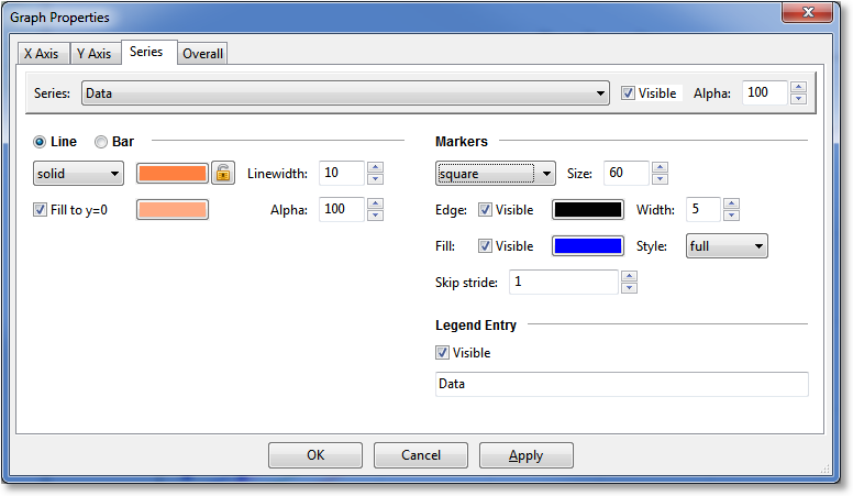
The Series page is where the settings for individual series can be changed. For quick help with any of the settings in this page, hover your mouse over any control.
The first item to choose is the Series; this determines which curve the settings in the dialog apply to. As the series is changed, the controls in the rest of the dialog will update appropriately. Next to the series chooser, you can set the Visible flag, and the overall transparency of the series via the Alpha control (100 being opaque, and 0 being fully transparent).
The next section can be either Line or Bar, depending on the selection of the user. A Line section indicates that the series should be drawn as a line with markers at each data point (both line and markers are optional, though, based on your specific settings for these). A Bar section indicates that the series should be drawn as a sequence of vertical bars extending upwards from y=0. If Bar is selected, there is no concept of markers or confidence/prediction bands (see below), so these sections are hidden.
The Line section obviously sets properties for the line; the linestyle can be chosen, as well as the color and width. The Resolution parameter determines how many pieces make up the curve, from the current minimum extent to maximum extent of the graph. Higher resolutions look more attractive, but take longer to draw. If your curve changes sharply over a short distance, increase the resolution in order to avoid a segmented look to the curve.
The lock button adjacent to the line color selector determines whether or not the marker edge color and fill color (see below) remain the same as the line color. If left unlocked, the marker edge color and fill color may be adjusted independently from line color. If locked, the marker edge color and fill color are always governed by the line color.
The Bar section sets properties for the bar sequence; the color of the bar border, linestyle of the bar borders, and the line width of the bar borders can be chosen. Further, the bar can be filled with a particular color that does not necessarily match the bar borders described above. The resolution determines the number of divisions to create over the current x range of the graph. Finally, the bar width can be either prescribed specifically as a horizontal extent, or set to Auto, which sets the width of each bar such that each bar touches the bar before and after.
The Marker section obviously sets properties for markers (this section is not visible while Bar is selected). The marker type can be chosen from a set of 22 different markers, and the marker size can be set with the Size control. Most markers (such as circles, squares, triangles, etc.) consist of both edge and fill; the edge is the outline of the shape, and the fill is the interior of the shape. Other markers (such as X, +, etc.) consist of only an edge, and the fill property has no effect. The edge and fill properties can be set independently in order to customize the markers to the maximum degree possible. Also, the markers can be half-filled or fully-filled according to the Style setting. If the marker distribution is too dense, the Skip Stride parameter can be increased in order to decrease the marker density on any particular series. Note that for a dataset, there is one marker per data point; for a continuous result, there is one marker per resolution increment set in the Line section. Also note that the marker edge and fill colors may only be adjusted if the “lock” button in the line section (see above) is unlocked.
The Legend Entry section gives control over the series’s appearance in the legend. Here, you can exclude the series from appearance in the legend, and also change the label that appears in the legend for the active series.
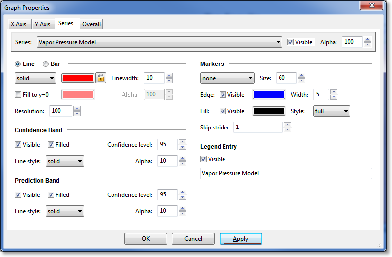
In both the Confidence band and Prediction band sections (these sections are not visible unless the series is a regression, and further, are not visible when Bar is selected), the visibility of the respective bands can be set via the Visible checkbox; if visibility is off, none of the other settings are significant. the Filled checkbox determines if the bands are drawn as a filled region or a pair of lines. The Confidence level allows you to set the desired probability level for the confidence bands or prediction bands; the default value for this probability is set via the Application Preferences. If the bands are drawn as a pair of lines, the Linestyle setting determines the style for those lines; the line color always matches the line color of the corresponding regression curve. If the bands are drawn as a filled region, the Alpha parameter determines the transparency of that region.
If the selected series at the top of the dialog is a 3D series, the Surface section becomes active, the the Marker section is hidden:
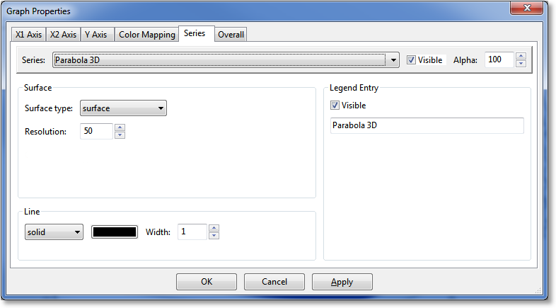
The Surface section allows you to set parameters for the 3D series. Here, the surface type can be selected as a scatter, wireframe, triangulated wireframe, surface, triangulated surface, 3D contour, or 3D filled contour. Like the corresponding parameter in the Line section, the Resolution parameter determines the number of intervals used in the X1 and X2 directions in order to form a mesh on which to evaluate the 3D function for visualization. Higher resolutions in this case will increase drawing time severely, as the amount of work to be done is proportional to the square of the resolution. Note that the color mapping applied to your 3D surface is set via the Color mapping section; see 3D Graphing for further information.
The Line section is still active for a 3D surface, because it affects the lines drawn around each of the patches that make up the 3D surface. In particular, for a wireframe surface, the colormap (which affects fill) is irrelevant, while the line style and width set in the Line section control the appearance of the lines that make up the wireframe.
Overall Page
The overall settings page is where the global settings for a plot are changed, such as the title, background, and legend box appearance. For quick help with any of the settings in this page, hover your mouse over any control.
The Canvas Aspect Ratio setting determines the aspect ratio of your plot. If set to Dynamic, which is the default, the plot will always fill the window that it resides in. However, there are many cases where the aspect ratio of the plot should be fixed; there are several predefined aspect ratios in the Canvas Aspect Ratio pulldown to select from, that fit common aspect ratios in use in various modern applications. If one of these fixed aspect ratios is set, your plot will automatically size itself in its parent window (leaving part of the parent window unpainted) appropriately in order to retain the desired aspect. If Custom is selected as the aspect ratio, you may type in the desired aspect (width/height) as a floating point number next to the pulldown.
The Title and Background section allows the title, font and color to be set. The position of the title is governed by the Position setting; this position is in the axes coordinate system, which is a system that is (0,0) at the bottom left corner of the axes frame, and (1,1) at the top right corner. The default position is (0.5,1.02), which places the title horizontally centered and above the top of the axes frame. Note that the title may be dragged and dropped interactively on the plot itself. The title can be turned completely off by unchecking the Visible box. Also, the background color (the area around the graph frame) can be set with the Background fill parameter.
In the Graph Frame section, the graph frame’s line color and width, along with its fill and transparency, can also be set. The position of the graph frame’s sides can be set by sliding the appropriate sliders near the bottom of this section; each side of the graph frame can also be turned on and off individually. The Use padding setting determines whether or not extra padding is added around the graph in order to make sure that all text (i.e., tick labels, axis labels, and titles) is visible. Turning the padding off provides finer control over the location of the axes frame (because there is not an automatic sizer involved; all sizing is explicit), but also will allow you to set the frame such that certain textual elements are not visible. Note that if you move/resize a frame interactivity in the plotting window (by pressing ‘r’ or shift-clicking the axes area), the padding switch is automatically turned off. A solid line, of the same thickness and color of the frame, can be drawn specifically at x=0 or y=0 by checking the appropriate box.
The Legend Box section is located in the right side of the Overall page. See Legend Properties for details.
Legend
The legend shows the mapping between a drawn entity on the plot and the dataset/function/model that it represents. Right click on a legend for the actions that be performed on the legend itself; one can change the look of the legend or reorder items in the legend (Legend Properties), or raise/lower legend itself in order for it to be drawn appropriately with other items on the graph.
Legend Properties
The legend properties can be accessed via the normal graph properties dialog (right click on the graph, choose Properties, and then go to the Overall tab), or can be accessed by right clicking on a legend itself. The legend properties dialog appears as below:
The entire legend box can be made invisible, and its placement in the graph can be chosen from the Placement chooser. If the placement is set to “specified location”, the XY location of the legend’s upper left corner can be set. The XY location is in graph coordinates, which run from (0,0) at the bottom left of the graph frame to (1,1) at the top right of the frame. The XY location can certainly be set to numbers greater than 1 or less than 0, in order to move the legend into the desired position.
Still in the Legend Box section, the color and linewidth of the legend frame can be selected, and the fill/transparency can also be selected. A legend title may be specified (along with a font and color), that is displayed above the legend entries and inside the legend box. A set of checkboxes allow the legend frame to be visible/invisible, have a drop shadow, have rounded corners, or have the labels in the legend assume the same colors as the line that they refer to.
At the bottom of the Legend Box section, the font and color of the legend labels can be selected. If markers need to be made smaller or larger in the legend, a Scale markers setting takes care of this. To lay your legend out in a multicolumn format, increase the number of columns in the Columns setting. To include more than one marker in a legend key, increase the Points in key setting.
Legend label editing
Legend labels may be changed in the Legend labels section, by clicking an already-selected label. The label will become editable, and you can change the text to whatever is desired. Remember that Mathtext can be used in a legend label as well. Also, the label can be made blank so that the series does not appear in the legend. Editing a label in this manner is exactly the same as doing so via the Series Page in the Graph Properties dialog.
Legend Ordering
The order of the series in of a legend can be changed by selecting the desired series’s legend label in the Legend labels section, and pressing the appropriate arrow buttons to arrange the ordering of the series. The topmost arrow button moves the selected series to the top; while the bottommost arrow button moves the selected series to the bottom. The inner two arrow buttons move the selected series up or down by one slot as appropriate.
The ordering of items in the legend also has another important role: it determines the order in which each series is drawn in the graph. So, if you would like a particular series to be drawn on top, move it to the front in the legend ordering. Series are drawn in reverse order as the legend ordering, which means that the item appearing on top of the legend order will also appear on top of other series in the graph.
Annotations
Annotations are essentially a text box (the text is optional, in which case an annotation can be more accurately described as a “shape”) with an optional arrow that points to any desired location. Annotations add any information content to a graph that is desired by the user, including equations. Mathtext is valid to use within an annotation wherever desired. Some annotation samples are shown below:
To add a new annotation, press the Annotation button in the Graph Toolbar, or press the N key while in a graph. When adding an annotation, the annotation properties dialog will appear, which is documented below. Another way to create an annotation is to clone an already existing one, by right clicking an annotation and picking Clone from the resulting menu.
Once an annotation has been added to the graph, it may be freely dragged and dropped to its desired location. If an annotation has its Fit to text property set (see below in the documentation for annotation properties), it may only be moved to a particular position; the size of the annotation is fixed. If Fit to text is not set, grab-handles will appear on the annotation when clicked, and these can be used to resize the annotation’s box as desired. In this mode, moving of the annotation proceeds as usual; just click and drag near the middle of the box.
The order in which the annotations are drawn (called the z-order) can be manipulated by right clicking an annotation and selecting one of the Send to back, Bring to front, Send backward, or Bring forward options. Note that the graph legend, arrows, and images also participate in the z-ordering process, so annotations can be placed in front of or behind the legend, other images, arrows, or other annotations as desired.
To edit an annotation, right click it and select Annotation Properties; alternatively, you can right click anywhere in the graph, select the Edit Annotation submenu, and select the annotation that you desire to edit.
To remove an annotation, right click it and select Remove, or press the DEL key after selecting the desired annotation. Alternatively, you can right click anywhere in the graph, select the Remove Annotation submenu, and select the annotation that you desire to delete.
Cutting, Copying, and Pasting Annotations
Cut/Copy/Paste is also supported for annotations; right click the desired annotation, and pick the desired cut or copy operation. Then, right click the plot, and if there is an annotation on the clipboard (from a previous cut/copy of an annotation), the Paste option will appear in the menu. Annotations may be freely copied/pasted between documents or even between invocations of GraphExpert Professional.
One trick that can be used is to paste an annotation as text into another application (such as notepad) for storage. You can then highlight the pasted text and copy to the clipboard, so that you can paste the annotation into a GraphExpert Professional graph at a later time. This is useful for annotations that are commonly used; you can build a library of common annotations as just text entries in a file that you store.
Annotation properties
When adding a annotation, or editing its properties, the following dialog will appear:
Text properties
The annotation properties dialog allows you to set all available properties for an annotation (except for the z-order, which will be discussed shortly). The Contents section is the text content of the annotation; recall that Mathtext is valid (place the mathtext between dollar signs), such that equations can be added if desired. The font of the annotation text can be adjust with the Font button. Horizontal alignment can be set to left aligned, centered, or right aligned. Any annotation can be rotated an an arbitrary angle as specified in the Rotation control; spacing between lines of a multiline annotation is given in Line spacing (a value of 1.2 is approximately equal to single spacing). The transparency of the text can be set in the Alpha control.
The (x,y) location of the center of the annotation box is specified by the Location fields. By default, the coordinate system used is the graph coordinate system, which is (0,0) at the bottom left of the axis frame, and (1,1) at the top right of the axis frame. However, if desired, the location can be expressed in data coordinates, in which case the center of the annotation box will always be pinned to the given (x,y) coordinate in the same system as the data set.
Note
In 3D plots, the only available coordinate system is the graph coordinate system (no data coordinate system supported).
Box properties
The middle section of the annotation properties dialog specifies the properties of the box surrounding the annotation text. The Show box control determines if the box is visible at all. The box style can be set to one of rectangular, square, ellipse, circle, diamond, rounded rectangular, sign, roundtooth, sawtooth, right facing arrow, left facing arrow, triangle, parallelogram-right, parallelogram-left, trapezoid, or inverted trapezoid.
The Fit to text control determines whether or not the box will be sized only to fit the text present (if any), or if the box will be sized according to the Specified size settings. The size given as a horizontal and vertical extent in the same coordinate system as given for the Location of the annotation box in the Text Properties section. Another way of specifying the size of the box is interactively on the graph itself. If an annotation has its Fit to text property set, it may only be moved to a particular position interactively; the size of the annotation is fixed. If Fit to text is not set, grab-handles will appear on the annotation when clicked, and these can be used to resize the annotation’s box as desired. In this mode, moving of the annotation proceeds as usual; just click and drag near the middle of the box.
A drop shadow behind the annotation box can be activated by selecting Shadowed. The Fill and Frame color selectors determine the color of the interior and frame of the box, respectively.
The transparency of the box can be set via the Alpha control, and the line width of the box frame is given via the Width control.
To create a box with no text, just leave the Contents field blank.
Arrow properties
The last section of the annotation properties dialog specifies the properties of the arrow, if any. If Show Arrow is checked, an arrow is drawn from the middle of the annotation box to the (x,y) point specified in the Points to fields. Like the location of the annotation textbox, the location of the annotated point can be in either graph coordinates or data coordinates.
Note
In 3D plots, the only available coordinate system for the annotated point is the graph coordinate system.
The appearance of the arrow is given by the Style, Connection style, and the Arrowhead placement/style fields. The arrow style can be one of plain, thick, wedge, or fancy; each arrow style has its own distinct appearance that can be most easily previewed by clicking the control itself. The connection style is how the arrow connects between the annotation and the point being annotated; the connection style can be a simple straight line, an arc, or a line that travels only in the X and Y directions appropriately to reach between the source and destination. The arrowhead placement/style determines the appearance of the arrowheads themselves, and whether or not the arrowheads are placed at both ends of the connecting line, at the annotation end of the connecting line, or the destination end of the connecting line.
Note that arrowhead placement/styles are only valid for “plain” arrow styles. Also, the XY connection style is only valid for the “plain” arrow style. Finally, the connection style for the “thick” arrow style is always straight. The graphical interface will prevent you from selecting invalid combinations of arrow style, connection style, and arrowhead style.
The line color, transparency, and width of the arrow can be set via the Line, Alpha, and Width controls, respectively.
Automatic annotations
An automatic annotation is an annotation with the name, formatted equation, and coefficients (if applicable) of a particular result. The content of this annotation can then be edited just like any other by right clicking it and selecting Annotation Properties.
For results that are plotted on a graph, an autoannotation can be generated in two ways. The first method is to right click the graph, and pick the appropriate result under the Autoannotate submenu; all results available on that graph will be available for selection. Secondly, you can generate an automatic annotation by pointing to the result (it will become highlighted), right clicking, and selecting Autoannotate.
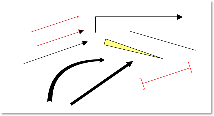
Arrows
Arrows are essentially lines that connect two points on a graph to indicate association between them, or to indicate a direction of information flow. Some arrow examples are shown below:
To add an arrow, press one of the “Add Arrow” buttons in the Graph Toolbar. When adding an arrow in this manner, an arrow will immediately appear near the center of your graph; you can then edit the arrow’s properties by right clicking on it and selecting Arrow Properties. Another way to create an arrow is to clone an already existing one, by right clicking an arrow and picking Clone from the resulting menu.
Once an arrow has been added to the graph, it may be freely dragged, resized and dropped to its desired location. The order in which the arrows are drawn (called the z-order) can be manipulated by right clicking an arrow and selecting one of the “Send to back”, Bring to front, Send backward, or Bring forward options. Note that the graph legend, annotations, and images also participate in the z-ordering process, so arrows can be placed in front of or behind the legend, other images, annotations, or other arrows as desired.
To edit an arrow, right click it and select Arrow Properties. To remove an arrow, right click it and select Remove or press the DEL key after selecting the desired arrow.
Cutting, Copying, and Pasting Arrows
Cut/Copy/Paste is also supported for arrow; simply right click the desired arrow, and pick the desired cut or copy operation. Then, right click the plot, and if there is an arrow on the clipboard (from a previous cut/copy of an arrow), the Paste option will appear in the menu. Arrows may be freely copied/pasted between documents or even between invocations of GraphExpert Professional.
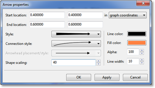
Arrow properties
When editing the properties of an arrow, the following dialog will appear:
The starting and ending xy locations (origin and destination) are given in the Start location and End location fields; each are in the coordinate system specified (graph or data coordinates).
Note
In 3D plots, the only available coordinate system for the source and destination point of the arrow is the graph coordinate system.
The appearance of the arrow is given by the Style, Connection style, and the Arrowhead placement/style fields. The arrow style can be one of plain, thick, wedge, or fancy; each arrow style has its own distinct appearance that can be most easily previewed by clicking the control itself. The connection style is how the arrow connects between the origin and destination points; the connection style can be a simple straight line, an arc, or a line that travels only in the X and Y directions appropriately to reach between the source and destination. The arrowhead placement/style determines the appearance of the arrowheads themselves, and whether or not the arrowheads are placed at both ends of the connecting line, at the starting end of the connecting line, or the destination end of the connecting line.
Note that arrowhead placement/styles are only valid for “plain” arrow styles. Also, the XY connection style is only valid for the “plain” arrow style. Finally, the connection style for the “thick” arrow style is always straight. The graphical interface will prevent you from selecting invalid combinations of arrow style, connection style, and arrowhead style.
The line color, transparency, and linewidth of the arrow can be set via the Line, Alpha, and Width controls, respectively.
The Shape scaling parameter determines the “fatness” of the arrow shape. Lower scalings lead to thinner arrow bodies (in cases where the arrow body is a shape, and not just a line), and smaller arrow heads. Higher scalings conversely lead to thicker arrow bodies and correspondingly larger arrow heads.
Note
To create a simple line on your graph, set the arrow style to plain, connection style to straight, and set the Arrowhead Placement/Style to the first selection (no arrowheads). This is done for you automatically via the line button in the Graph Toolbar palette.
Images
Images can be added to any graph, and will be saved along with the graph just with any other graph element. Images can be added by pressing the “Add Image” button in the Graph Toolbar (which will allow you to browse for the image file), via a clipboard paste from another application, or via drag and drop of an image file. Images are always first added at their native resolution, and then can be interactively moved and/or resized by clicking on them and dragging the appropriate handles. Images with embedded transparency will have that transparency respected.
Further image properties can be modified by right-clicking the image and selecting Image Properties. From the properties dialog, an image can be placed precisely, turned into a background, or have other image processing techniques applied to achieve a desired effect.
Supported images file formats are: PNG, BMP, JPEG, GIF, PCX, PPM, TGA, TIFF, WMF, XBM, XPM, and Photoshop 2.0/3.0 PSD files.
Once an image has been added to the graph, it may be freely dragged and/or resized to its desired location. The order in which the image are drawn (called the z-order) can be manipulated by right clicking an image and selecting one of the Send to back, Bring to front, Send backward, or Bring forward options. Note that the graph legend and annotations also participate in the z-ordering process, so images can be placed in front of or behind annotations, arrows, or the legend as desired.
To edit an image, right click it and select Image Properties; alternatively, you can right click anywhere in the graph, select the Edit Image submenu, and select the image that you desire to edit.
To remove an image, right click it and select Remove or hit the DEL key after selecting the image. Alternatively, you can right click anywhere in the graph, select the Remove Image submenu, and select the image that you desire to delete.
Cutting, Copying, and Pasting Images
Cut/Copy/Paste is also supported for annotations; right click the desired images, and pick the desired cut or copy operation. Then, right click the plot, and if there is an image on the clipboard (from a previous cut/copy of an images), the Paste option will appear in the menu. Images may be freely copied/pasted between documents or even between invocations of GraphExpert Professional.
To quickly delete an image, simply press the Delete key after selecting an image.
Image properties
When editing the properties of an image, the following dialog will appear:
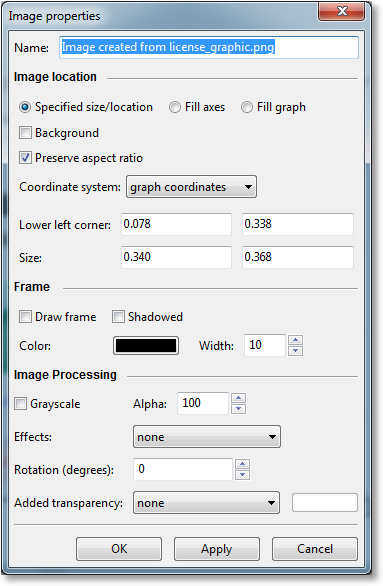
The Name field is only for identification of the image (at times, the image name will appear in the right-click graph properties menu to allow you to edit or delete the image directly). This name can be anything that you desire it to be.
Images always obey any built-in transparency (alpha) values. So, you can (for example) read in a PNG with transparency, and it will be displayed properly within GraphExpert Professional.
Image location
Images can be utilized on a graph in a number of different ways. By default, an image is treated similarly to any drawing program, where the location is specified by the Lower left corner and Size fields. The lower left corner and size can be changed directly, or more commonly, the image can be dragged and resized to the desired location on the graph. The interpretation of the coordinate numbers can be modified by choosing the appropriate coordinate system in the Coordinate system choice list. Graph coordinates are (0,0) at the lower left corner of the graph and (1,1) at the top right corner; axes coordinates are (0,0) at the lower left corner of the frame and (1,1) at the top right corner, and data coordinates are coordinates in the current x/y dataset.
Normally, images share z-ordering with annotations and legends, and can be placed as desired with the Bring to front, etc. right-click menu items. However, if you want the image to be placed behind everything on the graph, select the Background checkbox.
The Preserve aspect ratio property governs how the image behaves as the image is resized; if selected, the image always retains its aspect ratio; if not, the image will be free to stretch to retain its specified coordinates.
If the Fill axes checkbox is set, the image will be placed into the background and scaled such that it fills the axes frame. Likewise, if the Fill graph checkbox is set, the image will be placed into the background and scaled such that it fills the entire graph. If either of these options are selected, the image is automatically placed into the background and does not share z-order with other graph elements.
Image Frame
Any image can have a simple frame drawn around it, with the Draw frame and Shadowed settings. The frame color can be specified with the Color setting, and the frame’s line width can be modified with the Width setting.
Image Processing
GraphExpert Professional offers image processing facilities in order to create desired effects with your images. Your image is never modified with the image processing options; only its appearance. The Grayscale switch causes the image to be grayscaled before display. The Alpha setting determines the tranparency of the image.
The Effects setting sets a particular image filter that operates on the original image’s pixels, and outputs a changed image, much like filters in popular image processing software packages. Filters available are blur, contour, detail, edge enhance, emboss, find edges, smooth, and sharpen.
The image can be rotated arbitrarily with the Rotation setting. The rotation is given in degrees, and can range between positive and negative 360 degrees.
The Added transparency setting is a way to generate a transparency mask on an existing image. The color mask method allows you to select a particular color, and all pixels of that color are turned transparent. Floodfill from corners applies a flood fill at each of the four corner pixels of the image, filling with transparency until a different color is encountered.
Note
In 3D plots, the only available coordinate system is the graph coordinate system (no data coordinate system supported).
Saving graphs
To save a graph, either choose the Save button in the graph toolbar, or right click the graph and select Save. A file chooser will appear that allows you to select the location and filename of the graph to be saved, and the format of the picture file to be saved. For image (raster) files, supported filetypes are:
portable network graphics (PNG)
JPEG
TIFF
raw RGBA bitmaps (RGBA or RAW)
Supported vector graphics file formats are:
scalable vector graphics (SVG)
enhanced metafiles (EMF)
encapsulated postscript (EPS)
postscript (PS)
portable document format (PDF)
Of these formats, the PNG format is the most common for raster-type images, and SVG is most common for vector graphics. A PNG file can be read by any graphics application, and by applications such as Microsoft Word and Powerpoint. SVG files can be read by computer illustration software, such as Adobe Illustrator or Inkscape. It should be noted that an SVG file written by GraphExpert Professional retains all object information, so you can add or remove elements from the graph after-the-fact with an illustration package, if desired.
Copying graphs
To copy a graph, right click it and select Copy. An image will be copied to the clipboard, which can be subsequently pasted into any application that can receive an image from the clipboard, such as Microsoft Word.
Printing graphs
To print a graph, right click it and select Print Preview or Print, depending on the desired action. Alternatively, press the Print button in the graph toolbar associated with the desired graph.
Graph Themes
A graph theme gives the user the opportunity to set up the “look” of a graph once, and reuse these settings in subsequent graphs. A graph theme is a snapshot of the parameters set in the Graph Properties window (accessible by right-clicking a graph and selecting Properties) as well as the properties of elements on the graph, such as annotations and arrows. In fact, so that the appearance of annotations, legends, arrows, and images match the look of your graph, it is recommended to create one each element and configure them before saving the theme.
Saving a theme
To save the current look of your graph, right click the graph and select Save Theme. Give your theme a name, and select OK.
The second way to save a theme is to select Tools->Manage Graph Themes from the GraphExpert Professional main window; this gives access to a sandbox where you can change the graph look freely, and save the results when you are finished. See Graph Theme Manager.
Applying a theme
To apply a saved theme to your current graph, right click the graph and select Apply Theme, which will give access to all of the available saved themes. Select the desired theme, and the graph will change its look.
Copying/Pasting a theme
A theme can be copied by right clicking the graph and selecting Copy Current Theme. This operation internally stores the theme of the current graph so that you can use this theme on a another graph. To apply a previously copied theme, right click the graph and select Paste Theme. While this operation is extremely similar to a standard cut/paste clipboard operation, it does not actually use the clipboard; so, any item that you have on the clipboard remains intact. This does mean, however, that you cannot copy/paste themes between applications; if this is desired, just save and then apply the theme as documented above.
2D Contour Graphing
To create a contour plot, add a 3D dataset or function (one with two independent variables) on an XY plot.
Interactive Viewing
Mouse manipulations, panning and zooming in a contour plot is identical to that described above for normal XY graphs.
Changing 2D Contour Graph Properties
To access the graph properties, right click the graph, and select Graph Properties as usual. The main changes that you will see are that there is an extra tab for Color Mapping; so that you can set the colorbar appearance, as well as changing the mapping from values in the z direction (height) in the contour to a color. The color mapping panel (within the Graph Properties dialog) is shown below:
The Colorbar section allows the specification of the colorbar that is shown on the graph (as long as the Visible checkbox is set) to show the mapping between contour height (z) and a color. The Orientation selection determines if this colorbar is drawn in a vertical or horizontal orientation. The position, length, and width of the colorbar is given in the next section of fields; the position as well as the length and width are given in terms of axes coordinates, where (0,0) is the bottom left corner of the axes pane, and (1,1) is the upper right corner. The Font button allows the specification of the font and color of the text used to label the ticks on the colorbar.
The Color mapping section determines the mapping between contour height (z) and color. This mapping can be selected in the first pulldown; there are currently 130 choices for a colormap to use. The minimum value and maximum value given are mapped to the left and right end of the selected colormap, respectively. The tick increment can either be automatically determined or specified; the tick increment affects how many ticks are drawn in the colorbar.
Further, the Series section holds the settings for the contour series, when that series is selected in the Series pulldown. The relevant panel is shown below:
The Contour Lines section determines the overall appearance of the contour lines (or filled areas as appropriate). The Filled contour checkbox determines if the contour is drawn as a set of curves, or as a set of filled regions. The No. of Levels field determines the resolution with which the z (height) direction is filled with contour lines or filled regions, as appropriate. The Resolution field increases the number of line segments that are used to define the contour curve at a specific height (a higher resolution means a less segmeneted-looking contour curve). The Line Style and Line Width are active only when the contour is not filled, and determines the style and width of the lines used to draw the contour lines.
For more contour lines, increase No. of Levels. For a better quality draw of the contour lines, increase Resolution.
The Contour Labels section controls the inline height(z) labeling of the contour lines, and is only applicable when using unfilled contours. The Visible flag toggles whether or not the labels are drawn. Label colors match contour lines determines if the contour labels are colored the same as the contour line that they are associated with, or colored with the font color as selected in the color picker on the next line (labeled “Font size/color”). The Font size/color section determines the size of the labels and their color, provided that Label colors match contour lines is left unchecked. The Inline spacing determines the size of the break in the contour line in which the label is inserted; smaller sizes mean that the contour lines practically touch the label. The Precision and Formatting settings determine the number of decimal places used in the label, and the formatting style of the labels, respectively.
The Legend Entry section indicates whether this series should be listed in the legend, and if so, what label should be used (the default label in the legend is the name of the series, which is used if the legend label field is left empty).
3D Graphing
A 3D graph can be created by the user by selecting Create->3D plot from the GraphExpert Professional main menu, or by clicking the appropriate toolbar button. One can also create a new 3D plot by clicking the “+” tab in the graph notebook.
Note that pointing at a series in a 3D plot will not highlight it as is done in the 2D plots; this operation is too expensive to be carried out in an interactive way.
Interactive Viewing
For the most part, plotting in 3D is exactly the same as in 2D, except with more interactivity with the viewing angle.
Clicking and dragging the left mouse button on a 3D plot will dynamically change the viewing angle. Middle click and drag zooms the 3D plot.
Note
If you would rather zoom with the right mouse, go to Tools->Preferences->Graphing and check the appropriate box. However, the context menu (which normally takes a right click to access), is then mapped to the middle mouse button.
More transformations for the 3D plot are available via the pan button; please see Pan for details.
Changing 3D Graph Properties
To access the graph properties, right click the graph (or middle click, if you have remapped the mouse buttons for graphs), and select Properties as usual. The main changes that you will see are that there are three tabs for the axes, so that you can set scale and properties on the X1, X2, and Y axes appropriately.
Controls throughout the graph properties that are not applicable for 3D graphs are either hidden from view or disabled.
The other difference for 3D plots is within the Series section, where the controls have changed appropriately to deal with a 3D entity instead of a 2D line. You can still choose line width and color, which determines the line properties of the 3D object being drawn. The new Surface section allows you to set properties for your surface; the type can be set to the following:
scatter
wireframe
triangulated wireframe
surface
triangulated surface
contour
filled contour
The resolution determines the size of the mesh used to reconstruct the graphical object; i.e., if the resolution is 50, then a 50x50 mesh is created on which the 3D function is evaluated. The drawing expense rises dramatically with the resolution, so it is best to set this parameter as low as possible and still have a desirable looking graph. For a final render to picture or printer, you can raise this parameter in order to achieve the highest quality at the expense of (very) slow rendering. Note that resolution is ignored for irregular triangulated surfaces and wireframes; the points in the dataset being plotted are used directly.
The Color mapping section determines the mapping between the z dimension (the dependent variable) and color (often referred to as a pseudocolor map). This mapping can be selected in the first pulldown; there are currently 130 choices for a colormap to use. The min value and max value given are mapped to the left and right end of the selected colormap, respectively. Any surface that is drawn in any filled manner (i.e. not wireframed) will use these color mapping settings. The tick increment can either be automatically determined or specified; the tick increment affects how many ticks are drawn in the colorbar.
Keyboard Shortcuts for Graphs
Keyboard shortcuts can be used when a graph, or the notebook tab associated with the graph, has keyboard focus.
Keyboard Shortcut |
Action |
|---|---|
a |
autoscale. Identical to clicking the autoscale button in the graph toolbar. See Graph Toolbar and Autoscaling. |
p |
toggle panning mode. Identical to clicking the pan button in the graph toolbar. See Graph Toolbar. |
z |
toggle zooming mode. Identical to clicking the zoom button in the graph toolbar. See Graph Toolbar. |
r |
resize the graph frame interactively (pointer must be over the frame when r is pressed). |
x |
Open context sensitive properties dialog. Identical to right click->Properties. See Changing Graph Properties. |
1-9 |
Pressing a number button (1-9) will open the graph properties dialog directly to the corresponding series as listed in the legend. |
Shift + 1-9 |
Pressing a number button (1-9) will open the Details Window directly to the corresponding series as listed in the legend. |
Ctrl+C |
if the pointer is over an image, annotation, or arrow, copy it; if over the graph, copy the graph to the clipboard as an image. Identical to right click->Copy. See Graph Toolbar. |
Ctrl+V |
paste a graph element (image, annotation, or arrow) |
, |
move backward to the previous view. Identical to clicking the back button in the graph toolbar. See Graph Toolbar. |
. |
move forward to the next view. Identical to clicking the forward button in the graph toolbar. See Graph Toolbar. |
h |
return to the first view. Identical to clicking the home button in the graph toolbar. See Graph Toolbar. |
n |
add a new annotation |
r |
add a new arrow |
Mathtext
You can use a subset of TeX markup anywhere that a graph uses text (for a label, title, legend, annotation, etc.) by placing a bit of your text inside a pair of dollar signs ($). This capability allows you to typeset quite complex mathematical expressions within any text label on any plot. Regular text and math text can be freely intermixed. For example:
Surface Area $m^2$
renders as:

Note
To make it easy to display monetary values such as $100.00, if a single dollar sign is present in the entire string, it will be displayed as a dollar sign.
Greek letters and a large number of symbols are supported.
Subscripts and superscripts
To make subscripts and superscripts, use the '_' and '^' symbols:
$\alpha_i > \beta_i$

Some symbols automatically put their sub/superscripts under and over
the operator. For example, to write the sum of  from
from  to
to
 , you could do:
$\sum_{i=0}^\infty x_i$

Fractions, binomials and stacked numbers
Fractions, binomials and stacked numbers can be created with the
\frac{}{}, \binom{}{} and \stackrel{}{} commands,
respectively:
$\frac{3}{4} \binom{3}{4} \stackrel{3}{4}$
produces

Fractions can be arbitrarily nested:
$\frac{5 - \frac{1}{x}}{4}$
produces

Note that special care needs to be taken to place parentheses and brackets around fractions. Doing things the obvious way produces brackets that are too small:
$(\frac{5 - \frac{1}{x}}{4})$

The solution is to precede the bracket with \left and \right
to inform the parser that those brackets encompass the entire object:
$\left(\frac{5 - \frac{1}{x}}{4}\right)$

Radicals
Radicals can be produced with the \sqrt[]{} command. For example:
$\sqrt{2}$

Any base can (optionally) be provided inside square brackets. Note that the base must be a simple expression, and cannot contain layout commands such as fractions or sub/superscripts:
$\sqrt[3]{x}$
![\sqrt[3]{x}](_images/math/34bf72b84ec8cbca1273f6bccf372db27ac14354.svg)
Inline Fonts
The default font is italics for mathematical symbols.
To change fonts, eg, to write “sin” in a Roman font, enclose the text in a font command:
$s(t) = \mathcal{A}\mathrm{sin}(2 \omega t)$

More conveniently, many commonly used function names that are typeset in a Roman font have shortcuts. So the expression above could be written as follows:
$s(t) = \mathcal{A}\sin(2 \omega t)$

Here “s” and “t” are variable in italics font (default), “sin” is in
Roman font, and the amplitude “A” is in calligraphy font. Note in the
example above the calligraphy A is extremely close to the sin. You
can use a spacing command to add a little whitespace between them:
s(t) = \mathcal{A}\/\sin(2 \omega t)

The choices available with all fonts are:
Command
Result
\mathrm{Roman}
\mathit{Italic}
\mathtt{Typewriter}
\mathcal{CALLIGRAPHY}


Global Fonts
In GraphExpert Professional, there are three choices for the global font to use for math symbols: Computer Modern, STIX Serif, and STIX Sans Serif. To select one of these fonts, choose Edit->Preferences->Graphing->Global mathtext font.
The look of each font slightly different, with the Computer Modern font resembling the traditional TeX typsetting most closely, STIX Serif meant to blend with Serif-style fonts (such as Times New Roman), and STIX Sans Serif being a mathematical font without any serifs at all.
Accents
An accent command may precede any symbol to add an accent above it. There are long and short forms for some of them.
Command
Result
\acute aor\'a
\bar a
\breve a
\ddot aor\"a
\dot aor\.a
\grave aor\`a
\hat aor\^a
\tilde aor\~a
\vec a


In addition, there are two special accents that automatically adjust to the width of the symbols below:
Command
Result
\widehat{xyz}
\widetilde{xyz}


Care should be taken when putting accents on lower-case i’s and j’s.
Note that in the following \imath is used to avoid the extra dot
over the i:
r"$\hat i\ \ \hat \imath$"

Symbols
Other symbols available in math typesetting are listed below.
Lower-case Greek

\alpha

\beta

\chi

\delta

\digamma

\epsilon

\eta

\gamma

\iota

\kappa

\lambda

\mu

\nu

\omega

\phi

\pi

\psi

\rho

\sigma

\tau

\theta

\upsilon

\varepsilon

\varkappa

\varphi

\varpi

\varrho

\varsigma

\vartheta

\xi

\zeta
Upper-case Greek

\Delta

\Gamma

\Lambda

\Omega

\Phi

\Pi

\Psi

\Sigma

\Theta

\Upsilon

\Xi

\mho

\nabla
Hebrew

\aleph

\beth

\daleth

\gimel
Delimiters

/

[

\Downarrow

\Uparrow

\Vert

\backslash

\downarrow

\langle

\lceil

\lfloor

\llcorner

\lrcorner

\rangle

\rceil

\rfloor

\ulcorner

\uparrow

\urcorner

\vert

\{

\|

\}
![]](_images/math/c70cbddc5c90f5c12b6603e9428608e27f468863.svg)
]

|
Big symbols

\bigcap

\bigcup

\bigodot

\bigoplus

\bigotimes

\biguplus

\bigvee

\bigwedge

\coprod

\int

\oint

\prod

\sum
Standard function names

\Pr

\arccos

\arcsin

\arctan

\arg

\cos

\cosh

\cot

\coth

\csc

\deg

\det

\dim

\exp

\gcd

\hom

\inf

\ker

\lg

\lim

\liminf

\limsup

\ln

\log

\max

\min

\sec

\sin

\sinh

\sup

\tan

\tanh
Binary operation and relation symbols

\Bumpeq

\Cap

\Cup

\Doteq

\Join

\Subset

\Supset

\Vdash

\Vvdash

\approx

\approxeq

\ast

\asymp

\backepsilon

\backsim

\backsimeq

\barwedge

\because

\between

\bigcirc

\bigtriangledown

\bigtriangleup

\blacktriangleleft

\blacktriangleright

\bot

\bowtie

\boxdot

\boxminus

\boxplus

\boxtimes

\bullet

\bumpeq

\cap

\cdot

\circ

\circeq

\coloneq

\cong

\cup

\curlyeqprec

\curlyeqsucc

\curlyvee

\curlywedge

\dag

\dashv

\ddag

\diamond

\div

\divideontimes

\doteq

\doteqdot

\dotplus

\doublebarwedge

\eqcirc

\eqcolon

\eqsim

\eqslantgtr

\eqslantless

\equiv

\fallingdotseq

\frown

\geq

\geqq

\geqslant

\gg

\ggg

\gnapprox

\gneqq

\gnsim

\gtrapprox

\gtrdot

\gtreqless

\gtreqqless

\gtrless

\gtrsim

\in

\intercal

\leftthreetimes

\leq

\leqq

\leqslant

\lessapprox

\lessdot

\lesseqgtr

\lesseqqgtr

\lessgtr

\lesssim

\ll

\lll

\lnapprox

\lneqq

\lnsim

\ltimes

\mid

\models

\mp

\nVDash

\nVdash

\napprox

\ncong

\ne

\neq
\neq

\nequiv

\ngeq

\ngtr

\ni

\nleq

\nless

\nmid

\notin

\nparallel

\nprec

\nsim

\nsubset

\nsubseteq

\nsucc

\nsupset

\nsupseteq

\ntriangleleft

\ntrianglelefteq

\ntriangleright

\ntrianglerighteq

\nvDash

\nvdash

\odot

\ominus

\oplus

\oslash

\otimes

\parallel

\perp

\pitchfork

\pm

\prec

\precapprox

\preccurlyeq

\preceq

\precnapprox

\precnsim

\precsim

\propto

\rightthreetimes

\risingdotseq

\rtimes

\sim

\simeq

\slash

\smile

\sqcap

\sqcup

\sqsubset
\sqsubset

\sqsubseteq

\sqsupset
\sqsupset

\sqsupseteq

\star

\subset

\subseteq

\subseteqq

\subsetneq

\subsetneqq

\succ

\succapprox

\succcurlyeq

\succeq

\succnapprox

\succnsim

\succsim

\supset

\supseteq

\supseteqq

\supsetneq

\supsetneqq

\therefore

\times

\top

\triangleleft

\trianglelefteq

\triangleq

\triangleright

\trianglerighteq

\uplus

\vDash

\varpropto

\vartriangleleft

\vartriangleright

\vdash

\vee

\veebar

\wedge

\wr
Arrow symbols
\Downarrow

\Leftarrow

\Leftrightarrow

\Lleftarrow

\Longleftarrow

\Longleftrightarrow

\Longrightarrow

\Lsh

\Nearrow

\Nwarrow

\Rightarrow

\Rrightarrow

\Rsh

\Searrow

\Swarrow
\Uparrow

\Updownarrow

\circlearrowleft

\circlearrowright

\curvearrowleft

\curvearrowright

\dashleftarrow

\dashrightarrow
\downarrow

\downdownarrows

\downharpoonleft

\downharpoonright

\hookleftarrow

\hookrightarrow

\leadsto

\leftarrow

\leftarrowtail

\leftharpoondown

\leftharpoonup

\leftleftarrows

\leftrightarrow

\leftrightarrows

\leftrightharpoons

\leftrightsquigarrow

\leftsquigarrow

\longleftarrow

\longleftrightarrow

\longmapsto

\longrightarrow

\looparrowleft

\looparrowright

\mapsto

\multimap

\nLeftarrow

\nLeftrightarrow

\nRightarrow

\nearrow

\nleftarrow

\nleftrightarrow

\nrightarrow

\nwarrow

\rightarrow

\rightarrowtail

\rightharpoondown

\rightharpoonup

\rightleftarrows
\rightleftarrows

\rightleftharpoons
\rightleftharpoons

\rightrightarrows
\rightrightarrows

\rightsquigarrow

\searrow

\swarrow

\to

\twoheadleftarrow

\twoheadrightarrow
\uparrow

\updownarrow
\updownarrow

\upharpoonleft

\upharpoonright

\upuparrows
Miscellaneous symbols

\$

\AA

\Finv

\Game

\Im

\P

\Re

\S

\angle

\backprime

\bigstar

\blacksquare

\blacktriangle

\blacktriangledown

\cdots

\checkmark

\circledR

\circledS

\clubsuit

\complement

\copyright

\ddots

\diamondsuit

\ell

\emptyset

\eth

\exists

\flat

\forall

\hbar

\heartsuit

\hslash

\iiint

\iint
\iint

\imath
\infty

\jmath

\ldots

\measuredangle

\natural

\neg

\nexists

\oiiint

\partial

\prime

\sharp

\spadesuit

\sphericalangle

\ss

\triangledown

\varnothing

\vartriangle

\vdots

\wp

\yen