Getting started
This guide is a walkthrough of the use of GraphExpert Professional. This guide gives you essential information you need to know in order to use the application effectively, and demonstrates just a few of the software’s features. See the User Interface chapter for a full explanation of the user interface.
An introduction video is available; to watch it, click the blue video icon below (Internet connection required).

Load data into GraphExpert Professional
Read a sample file supplied with GraphExpert Pro. Choose File->Import Data, double click on “example_data”, and double click the file “speedline_exp_87.5_percent.dat”. When the File Import dialog appears, simply click OK (see Importing from file). When only one file is read in for import, the File Import dialog will guide you through the process. When multiple files are read in for import, each file is just imported with reasonable default settings. So, read in another five files, by choosing File->Import Data again, and select the rest of the speedline files this time (use the shift or ctrl key to multiselect them).
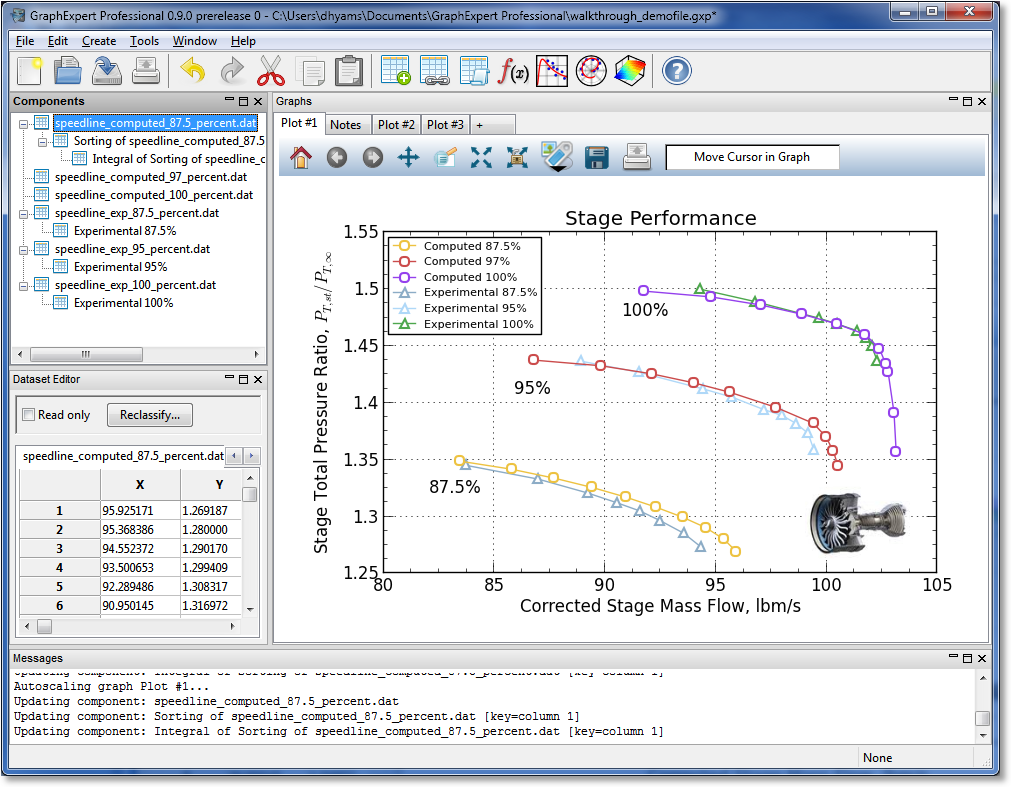
At this point, you should see all of the datasets listed in the Components Pane.
View the raw data
Double click one of the “speedline_computed” datasets to view it in the Dataset Editor. Also double click one of the “speedline_exp” datasets. GraphExpert Pro treats each column as a series, when things are plotted; obviously, the experimental data is not exactly oriented as we need it to be.
Perform an operation on some datasets
Right-click the “speedline_exp_87.5_percent.dat” component, and choose Operators->Transpose (see Transpose). The transpose is now shown in the Components Pane as a child component (see Managing Datasets and Functions). Double click the child (labeled “Transpose of…” at this point), to show how the dataset has been rearranged.
You can do the same operation to the other two experimental datasets. Use Shift or Ctrl to multiselect both, right-click, and select Operators->Transform as before.
Alternatively, the transpose operations could have been performed in the much more general Transformation facility (see Transform). To do this, right click a component, and select Transform. Taking the transpose of the entire dataset would use the expression:
DSET.T
here, DSET means the entire dataset, and .T means to take the transpose of it.
Rename your components (optional)
We would like to give these newly formed components nice names, so select one, and press F2 (alternatively, right click each and select Rename). Rename each transformation to whatever is desired (in this case, all are renamed to “Experimental xx%” or “Computed xx%”, where xx is the appropriate percentage).
Plot the datasets
Use your Ctrl key to multiselect all of the “computed” datasets, and the new transformed datasets that were just built. Right click, and select “Send to Current Plot”. Alternatively, you could just drag and drop the bunch of components to the graph.
Visualize
In order to visualize the datasets and results previously read and/or computed, you can either right-click each one and select “Send to Current Graph”, or drag and drop the desired item to a graph (see Graphing).
Apply a theme
Right click on the graph, and select Apply Theme->Elegant White - Soft. See Graph Themes.
Modify the plot
The properties of a graph can be extensively modified through the graph properties dialog (see Changing Graph Properties).
Double click each of the axis labels to change them to something more appropriate. For the y axis, enter:
Stage Total Pressure Ratio, $P_{T,st}/P_{T,\infty}$
For the x axis, enter:
Corrected Stage Mass Flow, lbm/s
This demonstrates how Mathtext works, which allows you to display mathematical equations and/or symbology anywhere on the graph.
Double click on the title of the graph, and change the title to “Stage Performance”.
Right click on the graph, and select Graph Properties. Under Series, you can adjust the appearance of each curve, and the label that appears in the legend. Here, if desired, change all of the experimental curves to use triangle-up as their markers, and change the legend entry to read something appropriate for all (we used “Computed 87.5%” and so on).
The legend text is still a little large and covers up part of the data, so double click the legend, and edit the legend labels on the right side of the dialog to shorten the names to something more practical. Alternatively, you can click “Label Font”, and decrease its point size such that the legend becomes small enough to fit into the empty upper left area of the graph. The legend can also be dragged and dropped into any desired location.
Add annotations
We can add annotations (see Annotations) to the plot by clicking the Artistic Elements button at the top of the graph; this button’s icon has a black downward pointing triangle. Click this, and click the blue tag; this will add an annotation to your graph. For the contents, type in “100%”, and turn off “Show box”. Press OK, and then drag the annotation around to where you want it to be. Place it next to the pair of curves that represent the 100% speedline. Now, you can either copy this annotation twice, or just add two more annotations for the 95% and 87.5% speedlines.
Add an image
To add an image (see Images) , just copy one to the clipboard and then right click the graph; select Paste. Alternatively, just press Ctrl+V while the Graphs pane is focused. Just to demonstrate how easy it is to add an image, use your web browser to search the web for “turbomachinery stage”, go to the images section of the search engine that you happen to use, right click an image, pick “Copy image”, and then retun to GraphExpert Professional and paste in the image.
Click the image to interactively resize and move it to the desired location. As always, right click to modify properties of the image.
Compute an integral
GraphExpert Professional has a library of computations that can be performed on a dataset. Return to the Components Pane, Right click one of the “computed” datasets, and pick Operators->Sort. Then on the newly created, sorted dataset, pick Operators->Integral. This creates a new dataset that can be viewed as the others can be in the Dataset Editor.
Learn how component updating works
GraphExpert Professional updates components automatically if their parent changes (see Managing Datasets and Functions). To show how this works, open the “speedline_computed_87.5_percent.dat” component in the Dataset Editor by double-clicking it. Change the value at row 2, column Y to 1.4. Notice that your plot has updated, but furthermore, the sorted component updated, and the integral updated. Double click them to view them and verify.
Place your graph in a report
This is extremely easy; just right click your graph and select Copy. Then go to your report software (i.e., Microsoft Word), and paste.
Add more plots
Select Create->Polar Plot and then Create->3D Plot. In this session, we don’t do anything with these plots, other than to let you know that they are available.