Working with Results
Introduction
Once any results have been calculated, they appear in the result pane ranked in order of their score (the result pane normally is shown in the upper left part of the CurveExpert Basic application, see User Interface). The score reflects how closely the model adheres to the underlying data.
In the results pane, the results can also be sorted by any of the items displayed in the column header (name, kind, family, score, correlation coefficient, coefficient of determination, or standard error) simply by clicking the appropriate column header. Note that you can right-click on the column header in order to customize what is displayed in the results list; by default, the name, kind, and score is displayed.
When selecting results, you can simply click on the result (which selects it), or use multiple selection by holding down SHIFT or CTRL when clicking on results. This allows you to apply an operation to batches of results at once.
Every result in the results pane has a unique icon indicating the kind of result that it is. The table below shows meaning of each icon.
Icon |
Meaning |
|---|---|
|
Linear regression model (includes polynomials) |
|
Nonlinear regression model (curve fit) |


Color Coding
Also in the results pane, each result has a color coding of green or yellow. An example is shown below:
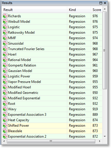
A green color coding indicates that the result was calculated successfully; it does not mean that the result is necessarily good; that is indicated by its score. The green coloring only indicates that the calculation of the result proceeded smoothly, and it is not possible to get a better result than what is given. In the common parlance of nonlinear regression, the parameters of the fit are said to be “converged”.
A yellow color coding indicates that the result should only be used with caution. It indicates that the calculation succeeded, but with reservations. The most common cause for this is a nonlinear regression calculation that did not converge before the maximum number of iterations (configurable via Edit->Preferences->Regression) was reached. Again, the score will indicate how well the model adheres to the data.
If a result is presented in yellow, the result should be used with caution. It is possible that the parameters would have changed further if the max number of iterations is higher.
Badges
Every result is badged with either a green checkmark or a yellow exclamation point. The intention here is to inform the user when a result becomes invalid due to a change in the underlying dataset. For example, if a nonlinear regression is calculated, and then the dataset is scaled (using, say, the tools in the Data menu), that nonlinear regression becomes invalid, and an attention badge is placed on that result in the results pane to signify this.
To remedy the situation, you can update the result yourself by right clicking on the result and selecting “Update”, or, if you would like to keep the old result and compute a new one, simply reselect the desired result from the Calculate menu, and an entirely new result will be generated.
Badge |
Meaning |
|---|---|
|
Data unchanged since calculation of this result |
|
Data changed since calculation of this result |


Previewing
Pointing at a result will show its preview in the preview pane, usually at the bottom left of your application. Also, the standard error and correlation coefficient, if applicable, will display in the status bar at the bottom of the application window.
Placing Results on a Graph
There are several ways for a result to be shown on a graph; the first is automatic, in that the top scoring results (usually the top 3), are automatically placed in the “Top Results” graph whenever a new calculation is performed.
In CurveExpert Basic, you may create new graphs for each individual result. To do so, right click a result in the Results pane, and select Send to New Plot. This will create a new graph with the default graph theme (as selected in the application preferences), and add the selected results to that plot.
Removing Results
If you decide that a result is no longer needed, select it, right click, and pick Remove. This action is not undoable, but certainly the result can be calculated again by simply picking it from the Calculate menu.
You can remove multiple results at once by shift-clicking or control-clicking to select the results that you want to remove. If the results are shown in any graph, they are removed from the graph as well.
Copying Result Information
Right clicking on a result will allow you to select Copy All Info, which will copy a report about the selected result(s) to the clipboard.
If the selected result is a regression, the entry Copy Parameters will also appear. Select this to copy only the parameter name/value pairs to the clipboard, separated by the delimiter selected in the application preferences.
Querying Result Details
If you want to get more detail on a calculated result, either double-click it in the Results pane, or right-click and select Details. This will display a window very similar to the following:
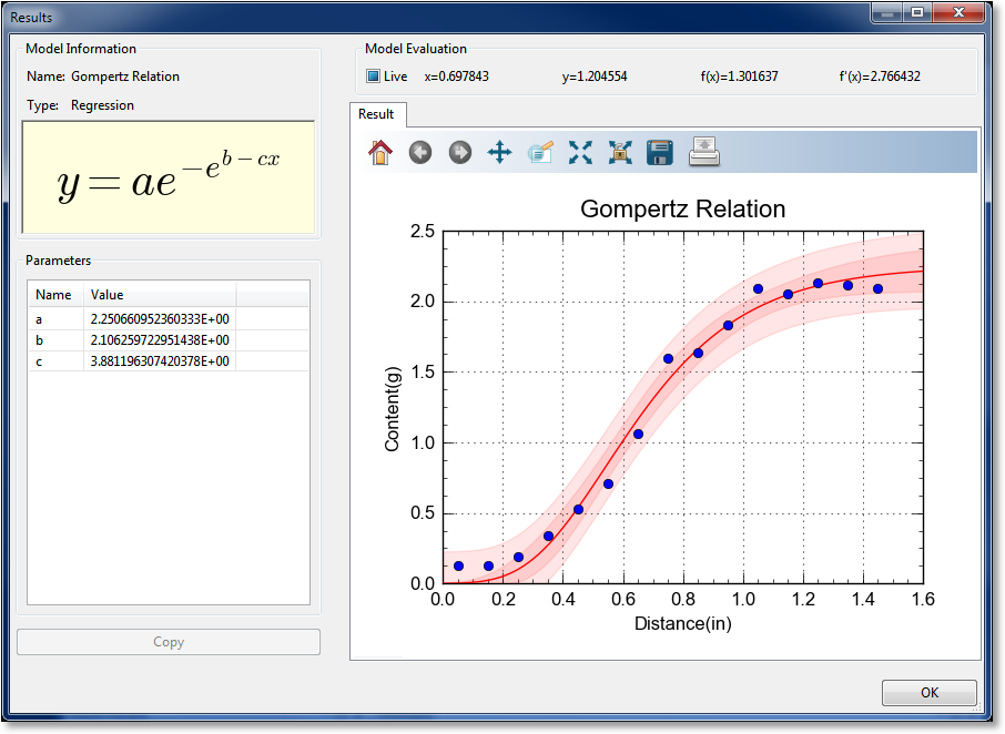
In the result details window, you can examine a particular result much more closely. The left pane shows the name of the result, its family, and an equation for the result, if applicable. For a model, the fitted parameters are also shown on the left. To copy result details to the clipboard in text format, simply click the Copy button.
Result Graph
The result graph simply shows the data and the current result, so that you can visualize the result without the (possible) clutter of having other results on the same plot. All of the graphing capabilities (see Graphing) are also available here, including zooming, panning, changing the graph properties, saving the plot to file or clipboard, and printing.
As you move your pointer over the graph, the live model evaluation tool above the notebook activates and displays your current xy location, the result evaluated at x, and the result’s derivative evaluated at x. A marker follows the result depedending on where the mouse pointer is placed. This behavior can be disabled by unchecking the “Live” box above the graph, or it can be made to only activate when the left mouse button is pressed ( by setting the “Live” box to its intermediate state).
Confidence and Prediction Bands
For any regression (linear or nonlinear), the confidence bands and prediction bands can be shown. In order to show these bands, and/or change their appearance, right click the plot, select Properties->Series, and then select the appropriate series (alternatively and much more quickly, if the regression is the 3rd entry in the legend, press 3). If the series is a regression, options to control the appearance of the confidence band and prediction band will be present. See Series Page for more information on changing the appearance of the bands.
The confidence band is the area that has a certain likelihood (typically 95%, but you can adjust the level to your liking) of containing the true curve that fits the data.
The prediction band is the area that has a certain likelihood (typically 95%, but you can adjust the level to your liking) of containing any future data points. The prediction band is always wider than the confidence band.